This summer the world was taken by the Barbie storm. The movie was a box office hit, grossing over $1.4bn and breaking all kinds of records along the way. It had an impact far beyond cinema too. Most notably, it encouraged more use of bright colours in various areas. It can have a fantastic impact on everything from fashion to commercial architecture. We want to look at the latter today to see why it is a good idea.
What can colour do?
 The right use of colours can have a stunning affect on various buildings, from office blocks to art galleries, libraries to shopping centres. It can make the properties more interesting, highlight features, and shape the visitor experience. Get it right and you can make a good impression that makes people want to come back.
A major thing colour can do here is work as a powerful communication tool. For example, if you have bright colours at the entrance, you make it stand out and almost yell for people to come in. Inside you can use colour to convey various messages or invite people to explore or relax. You can also highlight exits just in case there are emergencies.
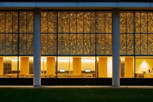
Colours are also fantastic for creating visual focal points in commercial architecture. It can add layers to any interior, especially if you use different bright shades and darker ones to contrast. This can turn boring features like columns into something that attracts attention. Highlighting features can turn them into points of interest.
Surprisingly, using colour can also enhance the lighting. A great way to do this is to carefully use darker shades. They will provide visual lightness. You can then have brighter shades to push the effect further.
Things to consider
While using bright colours is a great idea, you do need to think about a number of key things.
Colour has the power to shape perceptions, but you need to look at how and the messages you want to convey. The last thing you want is to use the colours with an idea in mind only to find you are making the space too busy or confusing.
It is also important to think about how the colours will last with time, particularly because commercial architecture can see a lot of footfall. They will rarely stay exactly the same. Wear and tear, exposure to light, and other factors can cause bright shades to become dull. You need to prepare for any changes in the colour and must look at maintenance, upkeep, and repairs.
Next, you need to consider how the colours will respond in different lighting conditions. They may be bright and interesting in broad daylight, but will they still be attractive at night? Lower light levels can make some colours feel more claustrophobic. You need to think about this or you can have problems.
Finally, you need to understand how some colour choices can limit your material selection. For example, you may not be able to choose bold shades if you want things like natural stone or concrete.
Do you need help with commercial architecture?
At Coffey Architects we understand that colours can have a massive impact on different buildings. If you use them effectively, you can get outstanding results. You can contact us for advice about how to use them and a variety of architectural services.